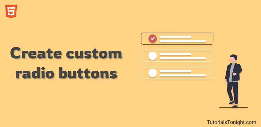
Create & Style Custom Radio Button
In this article, we are going to learn how to style and create your our own custom radio button. We will cover 5 different types of custom radio button.
The radio button that you see on a webpage is by default created by the browser. When you write <input type="radio"> browser itself renders the button, you need not to create it manually.
But what if you want to style it in your way?💡
Well, you can do it by using CSS. You can create your own custom radio button by using CSS. Let's see how.🚶♂️
- Style Radio Buttons
- Conclusion
Table Of Contents
Style Radio Button CSS
Let's start with the simplest one. This one is recreating the same default radio button but in a better way.
After we cover this we will look at some more advanced custom radio buttons.
Custom Button Example 1
Here is the basic custom radio button that we are going to create. It is a simple radio button which when clicked will create a circle in the center of the button and change the color of both the button and text.
# HTML Code
Start working with HTML code. Create an <input> element with type="radio" attribute.
Then add a <span> element for designing our custom radio button. Also, add another <span> element for showing the value of the radio button.
Finally, wrap the whole thing in a <label> element to increase the clickable area of our custom radio button.
<label>
  <input type="radio" name="gender" value="male">
  <span class="design"></span>
  <span class="value">Male</span>
</label>
Output:
This is how default radio button looks like.
# CSS code
Let's recreate the same radio button with little modification.
-
set use flexbox to align the label element to center and set some margin and add cursor as a pointer.
label { display: flex; align-items: center; margin: 15px 20px; cursor: pointer; } -
Second, hide the default radio button by setting opacity to 0. Then create the custom button using the <span> tag with a class design.
label input[type="radio"] { opacity: 0; } .design { width: 8px; height: 8px; border-radius: 50%; outline-offset: 3px; outline: 3px solid #888888; margin-right: 20px; } -
Finally, change the color of the custom button and text when the button is clicked. Also, change the color of the outline of the button.
label input[type="radio"]:checked~.design {
  outline-color: #a90a9c;
  background: #a90a9c;
}

input[type="radio"]:checked~.value {
  color: #a90a9c;
}
# Complete code
Radio button style
<style>
  label {
    display: flex;
    align-items: center;
    margin: 15px 20px;
    cursor: pointer;
    font-size: 20px;
  }

  input[type="radio"] {
    opacity: 0;
  }

  .design {
    width: 8px;
    height: 8px;
    border-radius: 50%;
    outline-offset: 3px;
    outline: 3px solid #888888;
    margin-right: 20px;
  }

  input[type="radio"]:checked~.design {
    outline-color: #a90a9c;
    background: #a90a9c;
  }

  input[type="radio"]:checked~.value {
    color: #a90a9c;
  }
</style>

<label>
  <input type="radio" name="gender" value="male" checked>
  <span class="design"></span>
  <span class="value">Male</span>
</label>
<label>
  <input type="radio" name="gender" value="female">
  <span class="design"></span>
  <span class="value">Female</span>
</label>
<label>
  <input type="radio" name="gender" value="other">
  <span class="design"></span>
  <span class="value">Other</span>
</label># Output
Custom radio button 2
With a little modification in the above example, we can achieve a more good-looking radio button.
We are going to add a growing and shrinking shade over the custom button for a better feel.
Here is how it works:
Our HTML part is going to be the same. We will use pseudo-element to add a growing and shrinking shade over.
Create a circular structure with ::before pseudo-elements and transform it to scale(0) and grow to scale(1) when the button is clicked.
Example 2
.design::before {
  content: "";
  position: absolute;
  display: block;
  width: 40px;
  height: 40px;
  border-radius: 50%;
  margin: 0 1px 1px 0;
  background-color: rgba(169, 10, 156, 0.1);
  transform: scale(0);
  transition: 0.4s;
}

input[type="radio"]:checked~.design::before {
  transform: scale(1);
  transition: 0.4s;
}# Output
Custom radio button 3
This style creates a nice capsule-shaped background around the selected option with a smooth transition.
Example 3
<style>
  label {
    display: flex;
    padding: 5px 0;
    font-size: 20px;
    cursor: pointer;
  }

  input[type="radio"] {
    opacity: 0;
  }

  .value {
    position: relative;
    display: flex;
    align-items: center;
    padding: 5px 20px 5px 40px;
    border-radius: 20px;
  }

  .value:hover {
    background: rgba(169, 10, 156, 0.1);
  }

  .value::before {
    content: "";
    position: absolute;
    left: 15px;
    width: 10px;
    height: 10px;
    border-radius: 50%;
    background: #dadada;
    outline: 0px solid #a90a9c;
    transition: 0.4s;
  }

  input[type="radio"]:checked~.value {
    color: #a90a9c;
    border-width: 5px;
    background: rgba(169, 10, 156, 0.2);
    transition: 0.4s;
  }

  input[type="radio"]:checked~.value::before {
    outline-width: 5px;
    background: #fff;
  }
</style>

<label>
  <input type="radio" name="gender" value="male" checked>
  <span class="value">Male</span>
</label>
<label>
  <input type="radio" name="gender" value="female">
  <span class="value">Female</span>
</label>
<label>
  <input type="radio" name="gender" value="other">
  <span class="value">Other</span>
</label>Custom radio button 4
In this radio button when you select an option then a dot jumps from the top and shakes. Which looks really cool.
Example 4
<style>
  label {
    display: flex;
    padding: 5px 0;
    font-size: 20px;
    cursor: pointer;
  }

  input[type="radio"] {
    opacity: 0;
  }

  .value{
    position: relative;
    display: flex;
    align-items: center;
    padding: 5px 20px 5px 40px;
    border-radius: 20px;
    overflow: hidden;
  }

  .value:hover {
    background: rgba(169, 10, 156, 0.1);
  }

  .value::before {
    content: "";
    position: absolute;
    left: 15px;
    width: 10px;
    height: 10px;
    border-radius: 50%;
    outline-offset: 3px;
    outline: 2px solid #a90a9c;
  }

  .value::after {
    content: "";
    position: absolute;
    left: 15px;
    top: -15px;
    width: 10px;
    height: 10px;
    border-radius: 50%;
    transition: 0.2s;
  }

  input[type="radio"]:checked~.value {
    color: #a90a9c;
    border-width: 5px;
    background: rgba(169, 10, 156, 0.2);
    transition: 0.4s;
  }
  input[type="radio"]:checked~.value::after {
    top: 11px;
    background: #a90a9c;
    animation: shake .15s 2;
  }

  @keyframes shake {
    0% { transform: translateY(0) }
    25% { transform: translateY(5px) }
    50% { transform: translateY(0) }
    75% { transform: translateY(-5px) }
    100% { transform: translateY(0) }
  }
</style>

<label>
  <input type="radio" name="gender" value="male" checked>
  <span class="value">Male</span>
</label>
<label>
  <input type="radio" name="gender" value="female">
  <span class="value">Female</span>
</label>
<label>
  <input type="radio" name="gender" value="other">
  <span class="value">Other</span>
</label>Custom radio button 5
This is totally different look from a radio button. In this button itself contains the written text.
Example 5
<style>
  .buttons {
    background: #dfdfdf;
    padding: 4px;
    border-radius: 3px;
    position: relative;
    width: fit-content;
  }

  .buttons input {
    appearance: none;
    cursor: pointer;
    border-radius: 2px;
    padding: 5px 10px;
    background: #3f414d;
    color: #ececec;
    font-size: 15px;
    font-family: sans-serif;
    transition: all 0.1s;
  }

  .buttons input:checked {
    background: #c926bb;
    box-shadow: 0 1px 1px rgba(0, 0, 0, 0.3);
    text-shadow: 0 1px 0px #808080;
  }

  .buttons input::before {
    content: attr(label);
    text-align: center;
  }
</style>

<div class="buttons">
  <input label="Male" type="radio" name="gender" value="male" checked>
  <input label="Female" type="radio" name="gender" value="female">
  <input label="Other" type="radio" name="gender" value="other">
</div>Conclusion
We have learned how to create custom radio buttons. Starting from the simple one we covered quite a complex one.
You can use any of the radio buttons in your project.
If you have any other methods to create a custom radio button, please share with us. We will be happy to add it to this article and give you the credit🙂.