Bootstrap Button with Icon And Text
In this tutorial, you will learn to create a bootstrap button with an icon and text, also we will play with the color of the button, icon, and text.
Whenever you visit a website you must have seen buttons over there. Either it is used to create some action or to trigger an event. Most of the buttons are used to take some action from the user side.
In this case, it becomes essential for web developers to create a beautiful button that explains their work.
Using bootstrap you can easily create such an action button. Also in this tutorial, you will be able to add icons to the button which adds extra meaning to the button.
- Bootstrap button
- Font-awesome icon
- Bootstrap button with icon
- Bootstrap button with icon and text
Table Of Contents
1. Bootstrap button
Bootstrap provides several predefined button style with semantic meaning. For example for dangerous action you can add btn-danger class to the button to create a red button, semantically it specifies danger.
To create a bootstrap buttons you have to use at least 2 classes:
btn- Thebtnclass provides the basic structure to the button, like padding, border, border-radius, etcbtn-*- The classes likebtn-primary,btn-danger,btn-success, etc specifies color, background-color and border-color to the button. Which gives different look to the button.
Here is an example of a simple bootstrap button.
Example
<button class="btn btn-primary">Primary Button</button>
<button class="btn btn-secondary">Secondary Button</button>
<button class="btn btn-warning">Warning Button</button>
<button class="btn btn-danger">Danger Button</button>
<button class="btn btn-info">Info Button</button>
<button class="btn btn-dark">Dark Button</button>
<button class="btn btn-success">Success Button</button>Output:

2. Font-awesome icons
The icons are not pre-build in HTML you have to use complex CSS, SVG, or external resources to get an icon. Here we will use font-awesome as an external resource to get free icons.
To use font-awesome icons add its CDN (content delivery network) to your webpage in the head section.
<head>
  <title>font awesome icons</title>
  <link rel="stylesheet" href="https://cdnjs.cloudflare.com/ajax/libs/font-awesome/4.7.0/css/font-awesome.min.css">
</head>
Now use the related icon class in the <i> tag and insert it in your webpage.
Example
<i class="fa fa-book"></i>
<i class="fa fa-glass"></i>
<i class="fa fa-home"></i>
<i class="fa fa-bars"></i>
<i class="fa fa-star"></i>3. Bootstrap icon button
Follow the given steps to create a bootstrap button with icon:
- Create a button element using the
.btnclass from Bootstrap. - Add a
.btn-*class to the button to style it differently (e.g.,.btn-primary,.btn-secondary, etc.). - Insert an
<i>tag within the button and add a.faand.fa-*class to it, specifying the desired Font Awesome icon.
Here is example code of a bootstrap button with icon.
Example
<button class="btn btn-primary"><i class="fa fa-book"></i></button>
<button class="btn btn-secondary"><i class="fa fa-glass"></i></button>
<button class="btn btn-warning"><i class="fa fa-home"></i></button>
<button class="btn btn-danger"><i class="fa fa-bars"></i></button>
<button class="btn btn-info"><i class="fa fa-star"></i></button>Output:
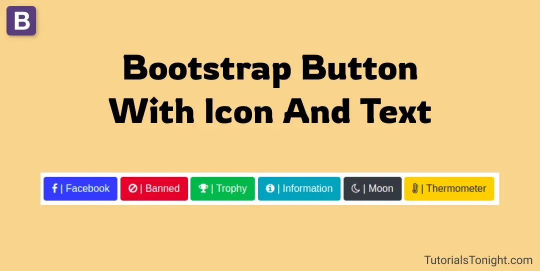
4. Bootstrap button with icon and text
To create a bootstrap icon button and text follow the following steps:
- Create a button using bootstrap with .btn class.
- Add btn-* class to the button to give the button a different look.
- Now create
<i>tag and addfa fa-*class to it and insert within the button. - Finally, add text to the button.
The code of the above step is shown below. (Do not forget to add font-awesome CDN to your webpage).
Example
<button class="btn btn-primary"><i class="fa fa-facebook"></i> | Facebook</button>
<button class="btn btn-danger"><i class="fa fa-ban"></i> | Banned</button>
<button class="btn btn-success"><i class="fa fa-trophy"></i> | Trophy</button>
<button class="btn btn-info"><i class="fa fa-info-circle"></i> | Information</button>
<button class="btn btn-dark"><i class="fa fa-moon-o"></i> | Moon</button>
<button class="btn btn-warning"><i class="fa fa-thermometer-full"></i> | Thermometer</button>Output:
Conclusion
We created Bootstrap buttons icon and text with the complete explanation. For icons, we used font-awesome and created multiple buttons with bootstrap.
You can also create a bootstrap button with only text or only icon by removing the <i> tag or text from the button.