Bootstrap Image Gallery
In this tutorial, you will learn to create a bootstrap image gallery with step-by-step instructions. The source code of each image gallery is also given.
It is necessary for image websites to present images in the most attractive ways by creating some animation, carousels, or gallery. Even for normal websites, it looks cool if you have a nice presentation of related images.
With bootstrap, you can create your own bootstrap image gallery with very little effort. We have included and discussed multiple image galleries in this article created using bootstrap and CSS.
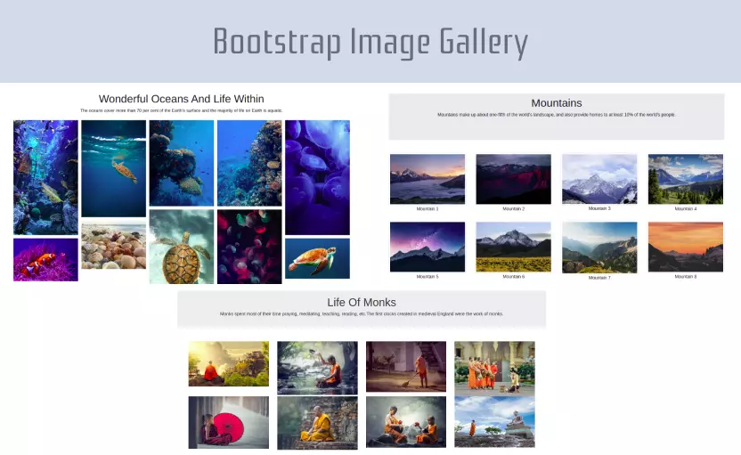
Image Gallery: 1
This is a simple image gallery that is created using bootstrap and a bit of CSS. The steps to create this image gallery are mentioned below.
- Add bootstrap CSS CDN to your webpage so that it can use the features of bootstrap.
- Create a container with the class container-fluid to keep our gallery images and other components inside it.
- Now add a heading and basic paragraphs for your gallery.
- Now there will be a big container that will hold a small container each having 2 images. So first create a bigger container by creating a div element and making it a flexbox container using bootstrap classes.
- Apply d-flex class to define it a flex container
- Add flex-wrap class for image blocks to wrap to next line if overflows
- Put these image blocks in the horizontal center of the webpage by justify-content-center class
- Now create the smaller container inside the bigger container. There will be multiple small containers each having 2 images.
- Makes images of smaller containers align in columns by using d-flex and flex-column classes.
Image gallery 1
<!-- bootstrap image gallery 1 -->
<div class="container-fluid">
  <h1 class="text-center">Wonderful Oceans And Life Within</h1>
  <p class="text-center">The oceans cover more than 70 per cent of the Earth’s surface and the majority of life on Earth is aquatic.</p>

  <div class="d-flex flex-wrap justify-content-center">
    <div class="d-flex flex-column">
      <img class="img-fluid" src="https://images.unsplash.com/photo-1580019542155-247062e19ce4?ixid=MnwxMjA3fDB8MHxzZWFyY2h8MXx8c2VhJTIwbGlmZXxlbnwwfHwwfHw%3D&ixlib=rb-1.2.1&auto=format&fit=crop&w=700&q=60">
      <img class="img-fluid" src="https://images.unsplash.com/photo-1596414086775-3e321ab08f36?ixid=MnwxMjA3fDB8MHxzZWFyY2h8N3x8c2VhJTIwbGlmZXxlbnwwfHwwfHw%3D&ixlib=rb-1.2.1&auto=format&fit=crop&w=700&q=60">
    </div>

    <div class="d-flex flex-column">
      <img class="img-fluid" src="https://images.unsplash.com/photo-1591025207163-942350e47db2?ixid=MnwxMjA3fDB8MHxzZWFyY2h8Mjd8fHNlYSUyMGxpZmV8ZW58MHx8MHx8&ixlib=rb-1.2.1&auto=format&fit=crop&w=500&q=60">
      <img class="img-fluid" src="https://images.unsplash.com/photo-1572720350370-8080412fc75b?ixid=MnwxMjA3fDB8MHxzZWFyY2h8NHx8c2VhJTIwbGlmZXxlbnwwfHwwfHw%3D&ixlib=rb-1.2.1&auto=format&fit=crop&w=700&q=60">
    </div>

    <div class="d-flex flex-column">
      <img class="img-fluid" src="https://images.unsplash.com/photo-1582967788606-a171c1080cb0?ixid=MnwxMjA3fDB8MHxzZWFyY2h8M3x8c2VhJTIwbGlmZXxlbnwwfHwwfHw%3D&ixlib=rb-1.2.1&auto=format&fit=crop&w=700&q=60">
      <img class="img-fluid" src="https://images.unsplash.com/photo-1572713629470-3e9f5d4fdf4c?ixid=MnwxMjA3fDB8MHxzZWFyY2h8Mnx8c2VhJTIwbGlmZXxlbnwwfHwwfHw%3D&ixlib=rb-1.2.1&auto=format&fit=crop&w=700&q=60">
    </div>

    <div class="d-flex flex-column">
      <img class="img-fluid" src="https://images.unsplash.com/photo-1572685165919-360a1322f41e?ixid=MnwxMjA3fDB8MHxzZWFyY2h8MTF8fHNlYSUyMGxpZmV8ZW58MHx8MHx8&ixlib=rb-1.2.1&auto=format&fit=crop&w=700&q=60">
      <img class="img-fluid" src="https://images.unsplash.com/photo-1559291001-693fb9166cba?ixid=MnwxMjA3fDB8MHxzZWFyY2h8MTZ8fHNlYSUyMGxpZmV8ZW58MHx8MHx8&ixlib=rb-1.2.1&auto=format&fit=crop&w=700&q=60">
    </div>

    <div class="d-flex flex-column">
      <img class="img-fluid" src="https://images.unsplash.com/photo-1570368294249-55d0da1c69fd?ixid=MnwxMjA3fDB8MHxzZWFyY2h8MjV8fHNlYSUyMGxpZmV8ZW58MHx8MHx8&ixlib=rb-1.2.1&auto=format&fit=crop&w=500&q=60">
      <img class="img-fluid" src="https://images.unsplash.com/photo-1437622368342-7a3d73a34c8f?ixid=MnwxMjA3fDB8MHxzZWFyY2h8MjJ8fHNlYSUyMGxpZmV8ZW58MHx8MHx8&ixlib=rb-1.2.1&auto=format&fit=crop&w=500&q=60">
    </div>
  </div>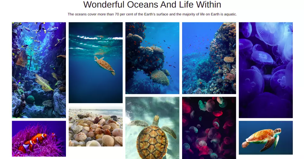
</div>Image Gallery: 2
Let's create another responsive image gallary using bootstrap. We will use bootstrap grids to create this gallery.
Each grid contains a figure element, which has an image and its caption. Here is how the gallery looks.
- For the bootstrap feature first, add CSS CDN to the webpage
- Create a container with class container-fluid to cover the full width of the webpage.
- Create a container with class jumbotron for Gallary heading and extra information
- Now we will have a row container which will have column cells that will have a span of 12 for extra smaller devices, 6 for smaller devices, 4 for medium devices, and 3 for large or extra-large devices. And each of these cells contains a figure element with an image and figure caption inside it.
- So create a div container with the class row.
- Inside row create cells with class col-sm-6, col-md-4, and col-lg-3.
- Now each of these cells contains a figure element with an image inside having class img-thumbnail and grayscale.
- Add CSS filter property for grayscale class so that it has
filter: grayscale(50%)when the mouse is over the image.
Image gallery 2
<!-- bootstrap image gallery 1 -->
<div class="container-fluid">
<div class="jumbotron">
<h1 class="text-center">Mountains</h1>
<p class="text-center">Mountains make up about one-fifth of the world's landscape, and also provide homes to at least 10% of the world's people.</p>
</div>
<div class="row">
<div class="col-sm-6 col-md-4 col-lg-3">
<figure>
<img src="https://images.unsplash.com/photo-1506905925346-21bda4d32df4?ixid=MnwxMjA3fDB8MHxzZWFyY2h8Mnx8bW91bnRhaW5zfGVufDB8fDB8fA%3D%3D&ixlib=rb-1.2.1&auto=format&fit=crop&w=700&q=60" class="img-thumbnail grayscale">
<figcaption>Mountain 1</figcaption>
</figure>
</div>
<div class="col-sm-6 col-md-4 col-lg-3">
<figure>
<img src="https://images.unsplash.com/photo-1477346611705-65d1883cee1e?ixid=MnwxMjA3fDB8MHxzZWFyY2h8M3x8bW91bnRhaW5zfGVufDB8fDB8fA%3D%3D&ixlib=rb-1.2.1&auto=format&fit=crop&w=700&q=60" class="img-thumbnail grayscale">
<figcaption>Mountain 2</figcaption>
</figure>
</div>
<div class="col-sm-6 col-md-4 col-lg-3">
<figure>
<img src="https://images.unsplash.com/photo-1454496522488-7a8e488e8606?ixid=MnwxMjA3fDB8MHxzZWFyY2h8NHx8bW91bnRhaW5zfGVufDB8fDB8fA%3D%3D&ixlib=rb-1.2.1&auto=format&fit=crop&w=700&q=60" class="img-thumbnail grayscale">
<figcaption>Mountain 3</figcaption>
</figure>
</div>
<div class="col-sm-6 col-md-4 col-lg-3">
<figure>
<img src="https://images.unsplash.com/photo-1464822759023-fed622ff2c3b?ixid=MnwxMjA3fDB8MHxzZWFyY2h8Nnx8bW91bnRhaW5zfGVufDB8fDB8fA%3D%3D&ixlib=rb-1.2.1&auto=format&fit=crop&w=700&q=60" class="img-thumbnail grayscale">
<figcaption>Mountain 4</figcaption>
</figure>
</div>
<div class="col-sm-6 col-md-4 col-lg-3">
<figure>
<img src="https://images.unsplash.com/photo-1519681393784-d120267933ba?ixid=MnwxMjA3fDB8MHxzZWFyY2h8N3x8bW91bnRhaW5zfGVufDB8fDB8fA%3D%3D&ixlib=rb-1.2.1&auto=format&fit=crop&w=700&q=60" class="img-thumbnail grayscale">
<figcaption>Mountain 5</figcaption>
</figure>
</div>
<div class="col-sm-6 col-md-4 col-lg-3">
<figure>
<img src="https://images.unsplash.com/photo-1486870591958-9b9d0d1dda99?ixid=MnwxMjA3fDB8MHxzZWFyY2h8OHx8bW91bnRhaW5zfGVufDB8fDB8fA%3D%3D&ixlib=rb-1.2.1&auto=format&fit=crop&w=700&q=60" class="img-thumbnail grayscale">
<figcaption>Mountain 6</figcaption>
</figure>
</div>
<div class="col-sm-6 col-md-4 col-lg-3">
<figure>
<img src="https://images.unsplash.com/photo-1434394354979-a235cd36269d?ixid=MnwxMjA3fDB8MHxzZWFyY2h8MTB8fG1vdW50YWluc3xlbnwwfHwwfHw%3D&ixlib=rb-1.2.1&auto=format&fit=crop&w=700&q=60" class="img-thumbnail grayscale">
<figcaption>Mountain 7</figcaption>
</figure>
</div>
<div class="col-sm-6 col-md-4 col-lg-3">
<figure>
<img src="https://images.unsplash.com/photo-1485160497022-3e09382fb310?ixid=MnwxMjA3fDB8MHxzZWFyY2h8MTR8fG1vdW50YWluc3xlbnwwfHwwfHw%3D&ixlib=rb-1.2.1&auto=format&fit=crop&w=700&q=60" class="img-thumbnail grayscale">
<figcaption>Mountain 8</figcaption>
</figure>
</div>
<div class="col-sm-6 col-md-4 col-lg-3">
<figure>
<img src="https://images.unsplash.com/photo-1491904768633-2b7e3e7fede5?ixid=MnwxMjA3fDB8MHxzZWFyY2h8MTV8fG1vdW50YWluc3xlbnwwfHwwfHw%3D&ixlib=rb-1.2.1&auto=format&fit=crop&w=700&q=60" class="img-thumbnail grayscale">
<figcaption>Mountain 9</figcaption>
</figure>
</div>
<div class="col-sm-6 col-md-4 col-lg-3">
<figure>
<img src="https://images.unsplash.com/photo-1458668383970-8ddd3927deed?ixid=MnwxMjA3fDB8MHxzZWFyY2h8MTh8fG1vdW50YWluc3xlbnwwfHwwfHw%3D&ixlib=rb-1.2.1&auto=format&fit=crop&w=700&q=60" class="img-thumbnail grayscale">
<figcaption>Mountain 10</figcaption>
</figure>
</div>
<div class="col-sm-6 col-md-4 col-lg-3">
<figure>
<img src="https://images.unsplash.com/photo-1540390769625-2fc3f8b1d50c?ixid=MnwxMjA3fDB8MHxzZWFyY2h8MjB8fG1vdW50YWluc3xlbnwwfHwwfHw%3D&ixlib=rb-1.2.1&auto=format&fit=crop&w=700&q=60" class="img-thumbnail grayscale">
<figcaption>Mountain 11</figcaption>
</figure>
</div>
<div class="col-sm-6 col-md-4 col-lg-3">
<figure>
<img src="https://images.unsplash.com/photo-1464278533981-50106e6176b1?ixid=MnwxMjA3fDB8MHxzZWFyY2h8MjJ8fG1vdW50YWluc3xlbnwwfHwwfHw%3D&ixlib=rb-1.2.1&auto=format&fit=crop&w=700&q=60" class="img-thumbnail grayscale">
<figcaption>Mountain 12</figcaption>
</figure>
</div>
</div>
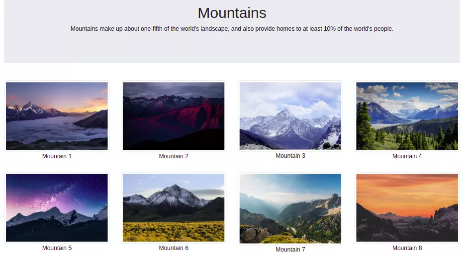
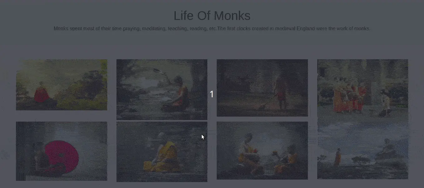
</div>Image Gallery: 3
Now we will create a responsive image gallary with image slider using bootstrap and baguetteBox javascript library. Same as pevious image gallery we will use bootstrap grids to create this gallery.
Each grid contains an image, which when clicked opens the image slider with the current image. You can slide the next and previous images in the slider. Here is how it looks.
- First, add bootstrap's and baguetteBox's CSS and JS CDN to the webpage
- Create a container with class container-fluid which will be a container for headings and image gallery.
- Now create a
divelement with class jumbotron for gallery heading and page description - There will be a row container with columns with classes col-sm-6, col-md-4, and col-lg-3 so that you can have different rows of images on different devices.
- Now within each cell create an anchor tag and put your image inside it, also give the same URL of the image to the anchor tag.
- Add CSS basic CSS styles and call the function
baguetteBox.run()with the class of your image container.
Image gallery 3
<!-- bootstrap image gallery 1 -->
<div class="container-fluid">
  <div class="jumbotron">
    <h1>Life Of Monks</h1>
    <p>Monks spent most of their time praying, meditating, teaching, reading, etc.The first clocks created in medieval England were the work of monks.</p>
  </div>

  <div class="row gallery">
    <div class="col-sm-6 col-md-4 col-lg-3">
      <a href="https://cdn.pixabay.com/photo/2017/04/08/22/26/buddhism-2214532__480.jpg">
        <img class="img-fluid"src="https://cdn.pixabay.com/photo/2017/04/08/22/26/buddhism-2214532__480.jpg">
      </a>
    </div>
    <div class="col-sm-6 col-md-4 col-lg-3">
      <a href="https://cdn.pixabay.com/photo/2016/11/08/05/16/boy-1807518__340.jpg">
        <img class="img-fluid"src="https://cdn.pixabay.com/photo/2016/11/08/05/16/boy-1807518__340.jpg">
      </a>
    </div>
    <div class="col-sm-6 col-md-4 col-lg-3">
      <a href="https://cdn.pixabay.com/photo/2019/08/21/09/31/monk-4420676__340.jpg">
        <img class="img-fluid"src="https://cdn.pixabay.com/photo/2019/08/21/09/31/monk-4420676__340.jpg">
      </a>
    </div>
    <div class="col-sm-6 col-md-4 col-lg-3">
      <a href="https://cdn.pixabay.com/photo/2016/11/14/04/14/monks-1822569__340.jpg">
        <img class="img-fluid"src="https://cdn.pixabay.com/photo/2016/11/14/04/14/monks-1822569__340.jpg">
      </a>
    </div>
    <div class="col-sm-6 col-md-4 col-lg-3">
      <a href="https://cdn.pixabay.com/photo/2016/11/08/05/20/boy-1807525__340.jpg">
        <img class="img-fluid"src="https://cdn.pixabay.com/photo/2016/11/08/05/20/boy-1807525__340.jpg">
      </a>
    </div>
    <div class="col-sm-6 col-md-4 col-lg-3">
      <a href="https://cdn.pixabay.com/photo/2016/11/08/05/22/buddhist-1807526__340.jpg">
        <img class="img-fluid"src="https://cdn.pixabay.com/photo/2016/11/08/05/22/buddhist-1807526__340.jpg">
      </a>
    </div>
    <div class="col-sm-6 col-md-4 col-lg-3">
      <a href="https://cdn.pixabay.com/photo/2016/11/03/04/02/boys-1793421__340.jpg">
        <img class="img-fluid"src="https://cdn.pixabay.com/photo/2016/11/03/04/02/boys-1793421__340.jpg">
      </a>
    </div>
    <div class="col-sm-6 col-md-4 col-lg-3">
      <a href="https://cdn.pixabay.com/photo/2016/10/30/05/46/monk-1782432__340.jpg">
        <img class="img-fluid"src="https://cdn.pixabay.com/photo/2016/10/30/05/46/monk-1782432__340.jpg">
      </a>
    </div>
  </div>
</div>

<script src="https://cdnjs.cloudflare.com/ajax/libs/baguettebox.js/1.11.1/baguetteBox.min.js"></script>
<script>
  baguetteBox.run(".gallery", {
    animation: "slideIn"
  });
</script>Conclusion
We looked at 3 different image galleries created using bootstrap. All the image galleries are responsive and can resize themselves on different devices. The last gallery also has an image slider which can be easily created using baguetteBox js.
The baguetteBox js is a javascript plugin that allows you to create image galleries with a very simple and easy to use interface.