CSS Toggle Switch with Text
In this section, we are going to learn how to create a CSS toggle switch with text. We will learn step by step how to create a toggle button first without any text and then with text. After we learn the basics of a toggle switch button, we will create 10 different toggle switch buttons.
There is no direct way to create a toggle button using HTML tags. We have to use CSS styling to create a toggle switch button.
The toggle switch looks like an on and off button that can be checked and unchecked to make it on or off respectively. You can see 10 different toggle switch buttons in the image below.
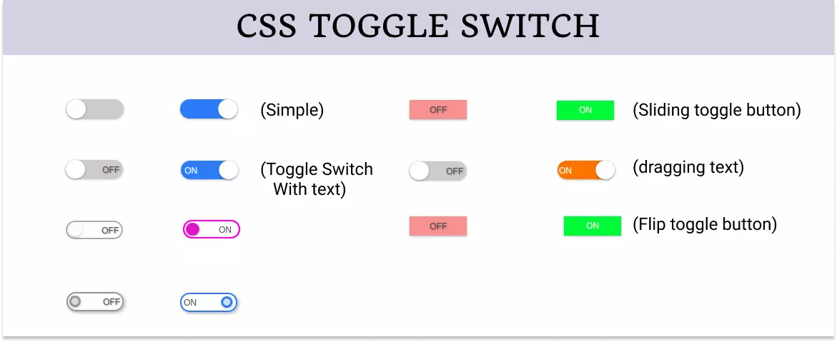
CSS Toggle Switch
Let's first start creating a simple toggle switch button to have a good start. If you want a bit more complex toggle button then you can skip this section.
# HTML Code
We know there is no direct HTML tag to create a toggle switch button but we can use the checkbox and then modify it using CSS to create a toggle button.
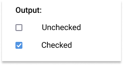
So we create a checkbox using the input element with the type checkbox.
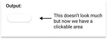
Since the checkbox has a very small clickable area but we need a greater area for the toggle switch so wrap it inside a label tag to increase the clickable area.
Also, add a span tag inside the label to create a slider later using CSS.
<label class="toggle">
  <input type="checkbox">
  <span class="slider"></span>
</label>
This creates a simple checkbox on the screen.
# CSS Code
Now start adding some CSS to make it look like a toggle button.
First, grab the label element and give it width, height, position, background color, border-radius, etc.
Give it a pointer cursor using cursor: pointer to make it look like a clickable area and also hide the checkbox.
The width and height of the label element are essential because it creates the actual clickable area of the toggle button.
/* styling lable */
.toggle {
    --width: 80px;
    --height: calc(var(--width) / 3);

    position: relative;
    display: inline-block;
    width: var(--width);
    height: var(--height);
    box-shadow: 0px 1px 3px rgba(0, 0, 0, 0.3);
    border-radius: var(--height);
    cursor: pointer;
}

/* hiding checkbox */
.toggle input {
    display: none;
}
Note: Use CSS variable to set the width and height of the label element because this way you just need to change dimension only once and the whole toggle button will adjust automatically.
# Creating Slider
Now create the slider of the toggle button using the span element.
Give it a position of absolute and top and left to align it with the label element.
Give it the width and height of the label element.
Now use the pseudo-class and create a circular slider handle.
/* Creating slider */
.toggle .slider {
    position: absolute;
    top: 0;
    left: 0;
    width: 100%;
    height: 100%;
    border-radius: var(--height);
    background-color: #ccc;
    transition: all 0.4s ease-in-out;
}
.toggle .slider::before {
    content: '';
    position: absolute;
    top: 0;
    left: 0;
    width: calc(var(--height));
    height: calc(var(--height));
    border-radius: calc(var(--height) / 2);
    background-color: #fff;
    box-shadow: 0px 1px 3px rgba(0, 0, 0, 0.3);
    transition: all 0.4s ease-in-out;
}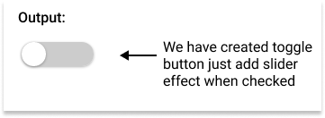
Finally, add the slider effect to the toggle button using the transition property.
/* Adding slider effect */
.toggle input:checked + .slider {
    background-color: #2196F3;
}
.toggle input:checked + .slider::before {
    transform: translateX(calc(var(--width) - var(--height)));
}
# Final output
Here is the complete code:
Example: Simple Toggle Switch Button
<!DOCTYPE html>
<html lang="en">

<head>
  <meta charset="UTF-8">
  <title>CSS Toggle Switch</title>
  <style>
    .toggle {
      --width: 80px;
      --height: calc(var(--width) / 3);

      position: relative;
      display: inline-block;
      width: var(--width);
      height: var(--height);
      box-shadow: 0px 1px 3px rgba(0, 0, 0, 0.3);
      border-radius: var(--height);
      cursor: pointer;
    }

    .toggle input {
      display: none;
    }

    .toggle .slider {
      position: absolute;
      top: 0;
      left: 0;
      width: 100%;
      height: 100%;
      border-radius: var(--height);
      background-color: #ccc;
      transition: all 0.4s ease-in-out;
    }

    .toggle .slider::before {
      content: '';
      position: absolute;
      top: 0;
      left: 0;
      width: calc(var(--height));
      height: calc(var(--height));
      border-radius: calc(var(--height) / 2);
      background-color: #fff;
      box-shadow: 0px 1px 3px rgba(0, 0, 0, 0.3);
      transition: all 0.4s ease-in-out;
    }

    .toggle input:checked+.slider {
      background-color: #2196F3;
    }

    .toggle input:checked+.slider::before {
      transform: translateX(calc(var(--width) - var(--height)));
    }
  </style>
</head>

<body>
  <label class="toggle">
    <input type="checkbox">
    <span class="slider"></span>
  </label>
</body>

</html>Output:
Adding Text In CSS Toggle Button
We created the above toggle button without any text. Let's move a step forward and add text to the toggle button.
To add text to the toggle button, we just need to add another HTML element inside the toggle button and style it using CSS to make it look like a label.
<label class="toggle">
  <input type="checkbox">
  <span class="slider"></span>

  <!-- label element 👇 -->
  <span class="labels" data-on="ON" data-off="OFF"></span>
</label>
Again use pseudo-class to create labels that shows ON and OFF text depending on the state of the toggle switch.
Set the opacity to 0 for the OFF state and 1 for the ON state when the toggle switch is not checked and reverse for the other state.
/* Adding text in the toggle button */
.toggle .labels {
    position: absolute;
    top: 8px;
    left: 0;
    width: 100%;
    height: 100%;
    font-size: 12px;
    font-family: sans-serif;
    transition: all 0.4s ease-in-out;
}

.toggle .labels::after {
    content: attr(data-off);
    position: absolute;
    right: 5px;
    color: #4d4d4d;
    opacity: 1;
    text-shadow: 1px 1px 2px rgba(0, 0, 0, 0.4);
    transition: all 0.4s ease-in-out;
}

.toggle .labels::before {
    content: attr(data-on);
    position: absolute;
    left: 5px;
    color: #ffffff;
    opacity: 0;
    text-shadow: 1px 1px 2px rgba(255, 255, 255, 0.4);
    transition: all 0.4s ease-in-out;
}

.toggle input:checked~.labels::after {
    opacity: 0;
}

.toggle input:checked~.labels::before {
    opacity: 1;
}
The above code will add text ON and OFF in the toggle button.
The complete code for toggle button with text is:
Example: Toggle Button with Text
<!DOCTYPE html>
<html lang="en">

<head>
  <meta charset="UTF-8">
  <title>CSS Toggle Switch with Text</title>
  <style>
    .toggle {
      --width: 80px;
      --height: calc(var(--width) / 3);

      position: relative;
      display: inline-block;
      width: var(--width);
      height: var(--height);
      box-shadow: 0px 1px 3px rgba(0, 0, 0, 0.3);
      border-radius: var(--height);
      cursor: pointer;
    }

    .toggle input {
      display: none;
    }

    .toggle .slider {
      position: absolute;
      top: 0;
      left: 0;
      width: 100%;
      height: 100%;
      border-radius: var(--height);
      background-color: #ccc;
      transition: all 0.4s ease-in-out;
    }

    .toggle .slider::before {
      content: '';
      position: absolute;
      top: 0;
      left: 0;
      width: calc(var(--height));
      height: calc(var(--height));
      border-radius: calc(var(--height) / 2);
      background-color: #fff;
      box-shadow: 0px 1px 3px rgba(0, 0, 0, 0.3);
      transition: all 0.4s ease-in-out;
    }

    .toggle input:checked+.slider {
      background-color: #2196F3;
    }

    .toggle input:checked+.slider::before {
      transform: translateX(calc(var(--width) - var(--height)));
    }

    .toggle .labels {
      position: absolute;
      top: 8px;
      left: 0;
      width: 100%;
      height: 100%;
      font-size: 12px;
      font-family: sans-serif;
      transition: all 0.4s ease-in-out;
    }

    .toggle .labels::after {
      content: attr(data-off);
      position: absolute;
      right: 5px;
      color: #4d4d4d;
      opacity: 1;
      text-shadow: 1px 1px 2px rgba(0, 0, 0, 0.4);
      transition: all 0.4s ease-in-out;
    }

    .toggle .labels::before {
      content: attr(data-on);
      position: absolute;
      left: 5px;
      color: #ffffff;
      opacity: 0;
      text-shadow: 1px 1px 2px rgba(255, 255, 255, 0.4);
      transition: all 0.4s ease-in-out;
    }

    .toggle input:checked~.labels::after {
      opacity: 0;
    }

    .toggle input:checked~.labels::before {
      opacity: 1;
    }
  </style>
</head>

<body>
  <label class="toggle">
    <input type="checkbox">
    <span class="slider"></span>
    <span class="labels" data-on="ON" data-off="OFF"></span>
  </label>
</body>
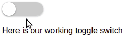
</html>Output:
Different Types Toggle Switch with Text
Let's now see multiple different types of toggle switch buttons with text.
Example 1: Blink Toggle Switch
Complete code for blink toggle switch with text is:
Example: Blink Toggle Switch
<!DOCTYPE html>
<html lang="en">

<head>
  <meta charset="UTF-8">
  <title>Blink toggle Switch with Text</title>
  <style>
    .toggle {
      --width: 80px;
      --height: calc(var(--width) / 3);

      position: relative;
      display: inline-block;
      width: var(--width);
      height: var(--height);
      border-radius: var(--height);
      cursor: pointer;
    }

    .toggle input {
      display: none;
    }

    .toggle .slider {
      position: absolute;
      top: 0;
      left: 0;
      width: 100%;
      height: 100%;
      border-radius: var(--height);
      border: 2px solid #aaa;
      transition: all 0.4s ease-in-out;
    }

    .toggle .slider::before {
      content: '';
      position: absolute;
      top: 1px;
      left: 2px;
      width: calc(var(--height)*0.9);
      height: calc(var(--height)*0.9);
      border-radius: calc(var(--height) / 2);
      background-color: #fff;
      box-shadow: 0px 1px 3px rgba(0, 0, 0, 0.3);
      transition: all 0.4s ease-in-out;
    }

    .toggle input:checked+.slider {
      border: 2px solid #f321e9;
    }

    .toggle input:checked+.slider::before {
      background-color: #ce67c9;
    }

    .toggle .labels {
      position: absolute;
      top: 8px;
      left: 50px;
      width: 100%;
      height: 100%;
      color: #4d4d4d;
      font-size: 12px;
      font-family: sans-serif;
      transition: all 0.4s ease-in-out;
    }

    .toggle .labels::after {
      content: attr(data-off);
      position: absolute;
      opacity: 1;
      text-shadow: 1px 1px 2px rgba(0, 0, 0, 0.4);
      transition: all 0.4s ease-in-out;
    }

    .toggle .labels::before {
      content: attr(data-on);
      position: absolute;
      opacity: 0;
      text-shadow: 1px 1px 2px rgba(255, 255, 255, 0.4);
      transition: all 0.4s ease-in-out;
    }

    .toggle input:checked~.labels::after {
      opacity: 0;
    }

    .toggle input:checked~.labels::before {
      opacity: 1;
    }
  </style>
</head>

<body>
  <label class="toggle">
    <input type="checkbox">
    <span class="slider"></span>
    <span class="labels" data-on="ON" data-off="OFF"></span>
  </label>
</body>

</html>Example 2: Toggle Switch with border
Complete code for toggle switch with border is:
Example: Toggle Switch with border
<!DOCTYPE html>
<html lang="en">

<head>
  <meta charset="UTF-8">
  <title>CSS - Toggle Switch with border</title>
  <style>
    .toggle {
      --width: 80px;
      --height: calc(var(--width) / 3);

      position: relative;
      display: inline-block;
      width: var(--width);
      height: var(--height);
      border-radius: var(--height);
      cursor: pointer;
    }

    .toggle input {
      display: none;
    }

    .toggle .slider {
      position: absolute;
      top: 0;
      left: 0;
      width: 100%;
      height: 100%;
      border-radius: var(--height);
      border: 2px solid #969696;
      box-shadow: 2px 2px 5px rgba(0, 0, 0, 0.3);
      transition: all 0.4s ease-in-out;
    }

    .toggle .slider::before {
      content: "";
      position: absolute;
      top: 2.5px;
      left: 2px;
      width: calc(var(--height)*0.6);
      height: calc(var(--height)*0.6);
      border-radius: calc(var(--height) / 2);
      border: 3px solid #969696;
      background-color: #dbdbdb;
      box-shadow: 0px 1px 3px rgba(0, 0, 0, 0.3);
      transition: all 0.4s ease-in-out;
    }

    .toggle input:checked+.slider {
      border-color: #2196F3;
    }

    .toggle input:checked+.slider::before {
      border-color: #2196F3;
      background-color: #c6e5ff;
      transform: translateX(calc(var(--width) - var(--height)));
    }

    .toggle .labels {
      position: absolute;
      top: 8px;
      left: 0;
      width: 100%;
      height: 100%;
      color: #4d4d4d;
      font-size: 12px;
      font-family: sans-serif;
      transition: all 0.4s ease-in-out;
    }

    .toggle .labels::after {
      content: attr(data-off);
      position: absolute;
      right: 5px;
      opacity: 1;
      text-shadow: 1px 1px 2px rgba(0, 0, 0, 0.4);
      transition: all 0.4s ease-in-out;
    }

    .toggle .labels::before {
      content: attr(data-on);
      position: absolute;
      left: 5px;
      opacity: 0;
      text-shadow: 1px 1px 2px rgba(255, 255, 255, 0.4);
      transition: all 0.4s ease-in-out;
    }

    .toggle input:checked~.labels::after {
      opacity: 0;
    }

    .toggle input:checked~.labels::before {
      opacity: 1;
    }
  </style>
</head>

<body>
  <label class="toggle">
    <input type="checkbox">
    <span class="slider"></span>
    <span class="labels" data-on="ON" data-off="OFF"></span>
  </label>
</body>

</html>Example 3: CSS Toggle Switch with Text Sliding
Complete code for toggle button with sliding text is:
Example: Toggle Switch with Sliding Text
<!DOCTYPE html>
<html lang="en">

<head>
  <meta charset="UTF-8">
  <title>CSS Toggle Switch with Sliding Text</title>
  <style>
    .toggle {
      --width: 80px;
      --height: calc(var(--width) / 3);

      position: relative;
      display: inline-block;
      width: var(--width);
      height: var(--height);
      box-shadow: 0px 1px 3px rgba(0, 0, 0, 0.3);
      border-radius: var(--height);
      cursor: pointer;
    }

    .toggle input {
      display: none;
    }

    .toggle .slider {
      position: absolute;
      top: 0;
      left: 0;
      width: 100%;
      height: 100%;
      border-radius: var(--height);
      background-color: #ccc;
      transition: all 0.4s ease-in-out;
    }

    .toggle .slider::before {
      content: "";
      position: absolute;
      top: 0;
      left: 0;
      width: calc(var(--height));
      height: calc(var(--height));
      border-radius: calc(var(--height) / 2);
      background-color: #fff;
      box-shadow: 0px 1px 3px rgba(0, 0, 0, 0.3);
      transition: all 0.4s ease-in-out;
    }

    .toggle input:checked+.slider {
      background-color: #f37521;
    }

    .toggle input:checked+.slider::before {
      transform: translateX(calc(var(--width) - var(--height)));
    }

    .toggle .labels {
      position: absolute;
      top: 8px;
      left: 0;
      width: 100%;
      height: 100%;
      font-size: 12px;
      font-family: sans-serif;
      transition: all 0.4s ease-in-out;
      overflow: hidden;
    }

    .toggle .labels::after {
      content: attr(data-off);
      position: absolute;
      right: 5px;
      color: #4d4d4d;
      opacity: 1;
      text-shadow: 1px 1px 2px rgba(0, 0, 0, 0.4);
      transition: all 0.4s ease-in-out;
    }

    .toggle .labels::before {
      content: attr(data-on);
      position: absolute;
      left: calc(var(--height) - var(--width) + 2px);
      color: #ffffff;
      opacity: 0;
      text-shadow: 1px 1px 2px rgba(255, 255, 255, 0.4);
      transition: all 0.4s ease-in-out;
    }

    .toggle input:checked~.labels::after {
      opacity: 0;
      transform: translateX(calc(var(--width) - var(--height)));
    }

    .toggle input:checked~.labels::before {
      opacity: 1;
      transform: translateX(calc(var(--width) - var(--height)));
    }
  </style>
</head>

<body>
  <label class="toggle">
    <input type="checkbox">
    <span class="slider"></span>
    <span class="labels" data-on="ON" data-off="OFF"></span>
  </label>
</body>

</html>Example 4: Toggle Switch with Flip Effect
Complete code for toggle button with sliding flip effect is:
Example: Toggle Switch with Flip Effect
<!DOCTYPE html>
<html lang="en">

<head>
  <meta charset="UTF-8">
  <title>CSS Toggle Switch with Flip Button</title>
  <style>
    .toggle {
      --width: 80px;
      --height: calc(var(--width) / 3);

      position: relative;
      display: inline-block;
      width: var(--width);
      height: var(--height);
      box-shadow: 0px 1px 3px rgba(0, 0, 0, 0.3);
      cursor: pointer;
    }

    .toggle input {
      display: none;
    }

    .toggle .labels {
      position: absolute;
      top: 0;
      left: 0;
      width: 100%;
      height: 100%;
      font-size: 12px;
      font-family: sans-serif;
      transition: all 0.4s ease-in-out;
    }

    .toggle .labels::after {
      content: attr(data-off);
      position: absolute;
      display: flex;
      justify-content: center;
      align-items: center;
      top: 0;
      left: 0;
      height: 100%;
      width: 100%;
      color: #4d4d4d;
      background-color: #f19999;
      text-shadow: 1px 1px 2px rgba(0, 0, 0, 0.4);
      transition: all 0.4s ease-in-out;
    }

    .toggle .labels::before {
      content: attr(data-on);
      position: absolute;
      display: flex;
      justify-content: center;
      align-items: center;
      top: 0;
      left: 0;
      height: 100%;
      width: 100%;
      color: #ffffff;
      background-color: #4fe132;
      text-align: center;
      opacity: 0;
      text-shadow: 1px 1px 2px rgba(255, 255, 255, 0.4);
      transition: all 0.4s ease-in-out;
    }

    .toggle input:checked~.labels::after {
      /* flip 180deg */
      transform: rotateY(180deg);
      opacity: 0;
    }

    .toggle input:checked~.labels::before {
      transform: rotateY(180deg) scale(-1, 1);
      opacity: 1;
    }
  </style>
</head>

<body>
  <label class="toggle">
    <input type="checkbox">
    <span class="labels" data-on="ON" data-off="OFF"></span>
  </label>
</body>

</html>Example 5: Toggle Switch with Sliding Button
Complete code for toggle switch with the sliding button is:
Example: Toggle Switch with Sliding Button
<!DOCTYPE html>
<html lang="en">

<head>
  <meta charset="UTF-8">
  <title>HTML toggle button with text and sliding button</title>
  <style>
    .toggle {
      --width: 80px;
      --height: calc(var(--width) / 3);

      position: relative;
      display: inline-block;
      width: var(--width);
      height: var(--height);
      box-shadow: 0px 1px 3px rgba(0, 0, 0, 0.3);
      cursor: pointer;
    }

    .toggle input {
      display: none;
    }

    .toggle .labels {
      position: absolute;
      top: 0;
      left: 0;
      width: 100%;
      height: 100%;
      font-size: 12px;
      font-family: sans-serif;
      transition: all 0.4s ease-in-out;
      overflow: hidden;
    }

    .toggle .labels::after {
      content: attr(data-off);
      position: absolute;
      display: flex;
      justify-content: center;
      align-items: center;
      top: 0;
      left: 0;
      height: 100%;
      width: 100%;
      color: #4d4d4d;
      background-color: #f19999;
      text-shadow: 1px 1px 2px rgba(0, 0, 0, 0.4);
      transition: all 0.4s ease-in-out;
    }

    .toggle .labels::before {
      content: attr(data-on);
      position: absolute;
      display: flex;
      justify-content: center;
      align-items: center;
      top: 0;
      left: calc(var(--width) * -1);
      height: 100%;
      width: 100%;
      color: #ffffff;
      background-color: #4fe132;
      text-align: center;
      text-shadow: 1px 1px 2px rgba(255, 255, 255, 0.4);
      transition: all 0.4s ease-in-out;
    }

    .toggle input:checked~.labels::after {
      transform: translateX(var(--width));
    }

    .toggle input:checked~.labels::before {
      transform: translateX(var(--width));
    }
  </style>
</head>

<body>
  <label class="toggle">
    <input type="checkbox">
    <span class="labels" data-on="ON" data-off="OFF"></span>
  </label>
</body>

</html>Conclusion
HTML does not provide direct support for toggle switches. In this guide we created CSS toggle button with text.
In this article, we have discussed how to create a toggle switch using CSS and also has explored multiple different types of it.