CSS Form Styling
In this tutorial, we will look at how to style a form using CSS. We will learn how to style the form elements like input, textarea, select, radio, checkbox, button, etc.
Before we proceed further, here is an example that shows the difference that CSS brings to a form.
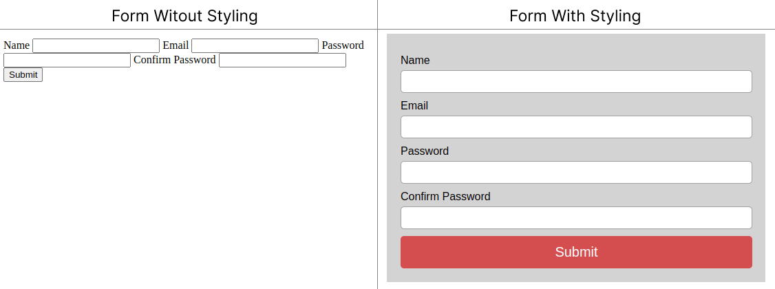
In the above image, you can see that the form on the right is styled using CSS and the form on the left is not styled at all. The form on the right looks much better than the form on the left. So, let's learn how to style a form using CSS.
Styling input fields
Let's start with styling the input fields.
To select all the input fields, you can use the input selector.
However, if you want to select a specific type of input field, you can use the input[type="text"] selector. Here, text is the type of input field.
Example
/* select text input fields */
input[type="text"] {
    width: 50%;
}

input[type="email"] {
    width: 100%;
}Output:
Giving padding to input fields
Padding creates space between the border and the content of the input field. Which looks nice.
To give padding to the input fields, you can use the padding property.
Output:
Adding border and border-radius
The border is the line that surrounds the input field. It increases the visibility of the input field.
To give a border to the input fields, you can use the border property, and to give border-radius to the input fields, you can use the border-radius property.
Output:
Changing the background color
To change the background color of the input fields, you can use the background-color property.
Choose a color that is different from the background color of the page. This will make the text more visible.
Example
input {
    background-color: #ff9f9f;
    color: white;
    margin: 10px 0;
    padding: 10px;
    border: none;
}Output:
Change input filed when it is focused
When an input field is focused, it means that the user is currently typing in that input field.
To show that the input field is focused, you can change its styling.
Use the :focus pseudo-class to select the input field when it is focused.
Output:
Adding icon to input field
Adding an icon to the input field makes it more attractive.
Using an icon you can show the purpose of the input field.
For example, if you want to add an icon to the email input field, you can use the input[type="email"] selector.
Then, you can use the background-image property to add the icon.
Use the background-repeat property to set the icon to repeat only once.
Use the background-position property to set the position of the icon (10px from the left and 50% from the top).
Use the background-size property to set the size of the icon.
Example
input[type="email"] {
    background-image: url("mail.svg");
    background-repeat: no-repeat;
    background-position: 10px 50%;
    background-size: 25px;
    padding-left: 20px;
}Output:
Add animation to input field
You can add animation on search fields like when you focus on the search field the width of the search field increases.
For this set different widths for the input field when it is focused and when it is not focused.
Also for a smooth transition between the two states, use the transition property.
Example
input {
    width: 200px;
    transition: width 0.4s ease-in-out;
}

input:focus {
    width: 100%;
}Output:
Styling Submit Button
Submit button is used to submit the form.
Use the input[type="submit"] selector to style the submit button.
You can refer CSS button tutorial to learn more about styling submit button.
Example
input[type="submit"] {
    background-color: #ff9f9f;
    color: white;
    padding: 10px 20px;
    border: none;
    border-radius: 5px;
    margin: 10px 0;
    width: 100%;
}Output:
Styling a Complete Form
Now, you have learned how to style different parts of a form. Let's style a complete form using CSS.
Here is an example of a complete form.
Example
<!DOCTYPE html>
<html lang="en">

<head>
  <meta charset="UTF-8">
  <title>Simple form in CSS</title>
  <style>
    form {
      max-width: 400px;
      margin: 20px auto;
      padding: 30px;
      border: 1px solid #e0b9b9;
      border-radius: 5px;
      background: #ffefef
    }

    .form-group {
      margin-bottom: 10px;
    }

    label {
      display: block;
      margin-bottom: 5px;
      font-family: sans-serif;
    }

    input,
    textarea {
      width: 100%;
      padding: 10px;
      border: 1px solid #e0b9b9;
      border-radius: 5px;
    }

    button {
      padding: 10px 20px;
      border: none;
      border-radius: 5px;
      background: #df6b6b;
      color: #fff;
      font-size: 1rem;
      cursor: pointer;
    }
  </style>
</head>

<body>
  <form>
    <div class="form-group">
      <label for="name">Name</label>
      <input type="text" id="name" name="name" placeholder="Your name">
    </div>
    <div class="form-group">
      <label for="email">Email</label>
      <input type="email" id="email" name="email" placeholder="Your email">
    </div>
    <div class="form-group">
      <label for="message">Message</label>
      <textarea id="message" name="message" placeholder="Your message"></textarea>
    </div>
    <div class="form-group">
      <button type="submit">Send</button>
    </div>
  </form>
</body>

</html>Conclusion
Styling form element brings a professional look to your website. You can use CSS to style different parts of a form such as input, textarea, submit button, etc.
In this tutorial, you have learned how to style different parts of a form using CSS.
You can use the online editor to practice the examples.