CSS Media Queries - Make Responsive Websites
In this tutorial, you will learn about the CSS media query. What is it used for, how you can use it and how to make a responsive website using it.
What is a media query?
Media query is a technique introduced in CSS3 which let users define different CSS styles for different devices and different screen sizes.
It can modify the appearance and even behaviour of your webpage based on certain matched conditions.
It is useful when you want to design a webpage that auto-adjusts according to different devices like Desktop, laptop, pads, tablet, mobile etc.
Media query is mainly used to target a particular viewport range. It uses the @media rule with the condition to define a block of CSS which is applied to element when the condition is true. Here is an example we will discuss in detail later in this section.
/* applied on screensize of 768px and above */
@media screen and (min-width:768px) {
  .box {
    /* apply your style */
  }
}
Not only viewport width you can target a lot of things like screen resolution, device type, screen orientation, etc.
Media query syntax
Now you have understood what a media query is, let's look at its syntax with examples.
A Media query has 4 different parts:
- At-rule (@media) - Media query starts with the @media ruleset itself.
- Logical operator (not, only, and) - Media query support logical operators like other programming languages like and, not, or (comma) and only.
- Media type (screen, printer, etc) - It defines the type of media we are targeting like print, screen, speech or all.
- Media-feature (width, max-width, height, etc) - Media feature target match features like width, height, aspect-ratio, orientation, etc.
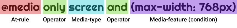
A media query starts with the @media keyword followed by media-type and conditions separated by the logical operation.
@media not|only media-type and (mediafeature) {
  /* your CSS here... */
}
Here is a working example, in this example when the screen width gets greater than 768px than the background color of the webpage change to a light green color.
body {
  background-color: lightpink;
}

@media only screen and (min-width:768px) {
  body {
    background-color: lightgreen;
  }
}Media Query min width
The min-width media feature is used to set CSS properties for an element which works only when the minimum width of the media type (screen) is greater than the specified width.
In the example below, the background color and color of the webpage change when the screen width is greater than 500px.
Example 1
body {
  background-color: black;
  color: white;
}

/* effective when minimum width is greater than 500px */
@media only screen and (min-width: 500px) {
  body {
    background-color: lightpink;
    color: black;
  }
}Note: media queries must be last to define in style because defined styles are taken into consideration from top to down, if any media query is defined for any selector before defining normal CSS for that selector then the media query is ignored.
Here is another example where the column width increases to 100% when the viewport width gets smaller than 576px.
Example 2
.container {
  display: flex;
  flex-wrap: wrap;
  border: 1px solid black;
}

.col {
  width: 100%;
  text-align: center;
  outline: 1px solid gray;
  height: 30px;
  background-color: lightgreen;
}

@media only screen and (min-width:576px) {
  .col {
    width: 50%;
  }
}Media Query max width
The max-width in the media query is used to set CSS properties which work only when the maximum width of the media type (screen) is smaller than or equal to the specified width.
body {
  background-color: black;
  color: white;
}

/* effective when minimum width is greater than 500px */
@media only screen and (max-width: 500px) {
  body {
    background-color: lightpink;
    color: black;
  }
}Note: The operator only is optional operator modern browser don't need it.
/* this is also valid */
@media screen and (max-width: 500px) {
  body {
    background-color: lightpink;
    color: black;
  }
}
Hiding an element on mobile using media query
There are some situations when you want to hide certain elements of a webpage on a mobile device or divide with a specific viewport width.
You can use CSS display property and set it to none below breakpoint for mobile (here 320px is used).
div {
  background-color: tomato;
  color: white;
  padding: 10px;
  margin: 5px;
}

/* effective when window width is smaller than 320px */
@media screen and (max-width: 320px) {
  div {
    display: none;
  }
}Combining multiple media feature
Media query let you combine multiple media feature (condition) as well as multiple media types separated by logical operators.
Here is an example which target device width with viewport width between 500px to 800px. When device width is between 500px to 800px then background is lightgreen else white.
@media (min-width:500px) and (max-width:800px) {
  body {
    background-color: lightgreen;
  }
}Inverting a query meaning
The not logical operator inverts the entire meaning of the media query. It will invert only the specified media query it is applied to.
If there are other comma-separated media query then it is not applied to all.
The not is evaluated last in the query.
@media not screen and (print) { ... }The above query is evaluated like this:
@media not (screen and (print)) { ... }Not like this:
@media (not screen) and (print) { ... }Here is another example:
@media not screen and (color), print and (min-width:500px) { ... }The above query is evaluated like as follows:
@media (not screen and (color)), print and (min-width:500px) { ... }Not like as follows:
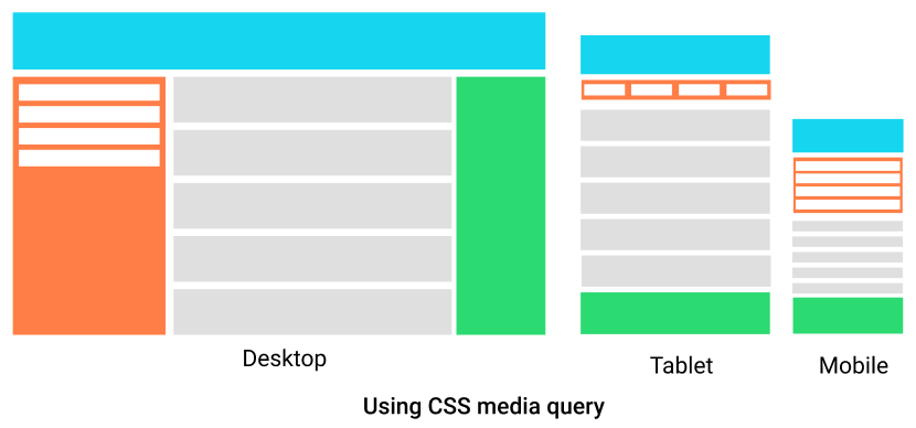
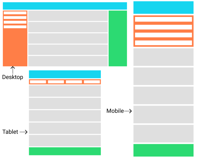
@media (not screen and (color), print and (min-width:500px)) { ... }Designing a responsive website using media query
The idea of the responsive website was generated from a media query.
Responsive websites are those websites that adjust elements size, alignment and orientation based on device width.
Let's design a webpage that is responsive to using media queries.
<!DOCTYPE html>
<html lang="en">

<head>
  <meta charset="UTF-8">
  <meta http-equiv="X-UA-Compatible" content="IE=edge">
  <meta name="viewport" content="width=device-width, initial-scale=1.0">
  <title>CSS - media query responsive webiste</title>
  <style>
    .container {
      display: flex;
      flex-direction: column;
    }

    .header {
      height: 80px;
      background-color: #16d5ef;
    }

    .left-sidebar {
      display: flex;
      flex-direction: column;
      width: 100%;
      height: 200px;
      margin-top: 10px;
      background-color: #ff7e47;
    }

    .sidebar-column {
      height: 30px;
      margin: 10px;
      background-color: white;
    }

    .main-element {
      padding: 0;
    }

    .main-column {
      background-color: #dfdfdf;
      height: 112px;
      margin-top: 10px;
    }

    .right-sidebar {
      height: 80px;
      margin-top: 10px;
      background-color: #2cda72;
    }

    @media (min-width:600px) {
      .left-sidebar {
        height: 50px;
        flex-direction: row;
      }

      .sidebar-column {
        width: calc(25% - 20px);
      }
    }

    @media (min-width:768px) {
      .container {
        flex-direction: row;
      }

      .left-sidebar {
        width: 20%;
        height: 600px;
        flex-direction: column;
      }

      .main-element {
        width: 65%;
        padding: 0 10px;
      }

      .sidebar-column {
        width: calc(100% - 20px);
        margin: 10px;
      }

      .right-sidebar {
        width: 15%;
        height: 600px;
      }
    }
  </style>
</head>

<body>
  <h2>Responsive website using media query</h2>
  <!-- Header -->
  <div class="header"></div>
  <div class="container">
    <!-- Left sidebar -->
    <div class="left-sidebar">
      <div class="sidebar-column"></div>
      <div class="sidebar-column"></div>
      <div class="sidebar-column"></div>
      <div class="sidebar-column"></div>
    </div>
    <!-- Main element -->
    <div class="main-element">
      <div class="main-column"></div>
      <div class="main-column"></div>
      <div class="main-column"></div>
      <div class="main-column"></div>
      <div class="main-column"></div>
    </div>
    <!-- Right sidebar -->
    <div class="right-sidebar"></div>
  </div>
</body>

</html>Output:
Using Media Query in HTML
Media queries are not only applied in CSS but can be directly applied in HTML to load resources based on media type and media features.
Loading different external CSS based on viewport size
<link> element used for loading external CSS file to the webpage can use media attribute to load CSS file optionally.
<!-- Loaded to all users -->
<link rel="stylesheet" href="all.css" media="all">
<!-- Loaded to screens 320px or more wide -->
<link rel="stylesheet" href="small.css" media="(min-width: 320px)">
<!-- Loaded to screens 768px or more wide -->
<link rel="stylesheet" href="medium.css" media="(min-width: 768px)">
<!-- Loaded to print medias -->
<link rel="stylesheet" href="print.css" media="print">
You can see in the above code, you can load different CSS files based on device type or viewport size. It improves the page targeting for the different device as CSS loaded is more specific to the device.
But, this is not always the case when a small device like mobile visits the page then it loads the only file that satisfies the condition of a media query, while when you visit a device with a bigger viewport then it loads all CSS files for a matching device.
Not only in CSS files but you can use it load different <source> in <picture> element.
<picture>
  <!-- Load this image if the screen is at least 600px wide -->
  <source srcset="logo.webp" media="(min-width: 600px)">
  <!-- Load this image if the screen is at least 768px wide -->
  <source srcset="logo.webp" media="(min-width: 768px)">
  <!-- Load this image if nothing matches -->
  <img src="logo.webp" alt="A logo">
</picture>
Using Media Query in JavaScript
You can use media query in JavaScript also. You can create a media condition that targets a specific media type or media feature.
Use window.matchMedia() to define the condition.
// it is a media condition that target 768px or more wide viewport
const mediaQuery = window.matchMedia("(min-width: 768px)");
if (mediaQuery.matches) {
  console.log("Query matched!");
}
Conclusion
Nowadays it is necessary for your website to be responsive. And if you want to make responsive websites then media query is at the core. For responsive websites, the most famous choice is bootstrap framework, even bootstrap use media query at its code for responsiveness.
Points to remember:
- Media query can conditionally apply CSS properties to certain elements of the webpage when the device type of viewport dimension matches.
- It can load different resources only for a targeted device or targeted screen size. like in the <picture> element you can set multiple sources of an image that will load when a certain media condition satisfies.
- It will load an external CSS file that is attached for a media query even when the query is false in <link> element but will not apply its property to the page until the condition is true.
- Using
window.matchMediamedia query can also be used in JavaScript.