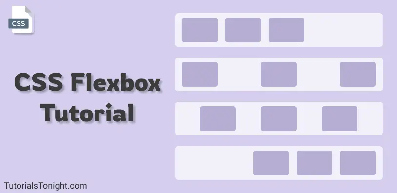
CSS Flexbox Tutorial
Flexbox is a 1-dimensional layout model in CSS. It is a module that comes with lots of CSS properties and can be used to create complex layouts.
- What is CSS flexbox?
- Understanding Flexbox
- How to use flexbox?
- All CSS Flexbox Properties
- Flexbox CSS properties for container itself (Parent)
- Flexbox CSS properties for container's items (Child)
Table Of Contents
What is CSS flexbox?
CSS flexbox is a one-dimensional web layout method that is used to arrange HTML containers in a row or column.
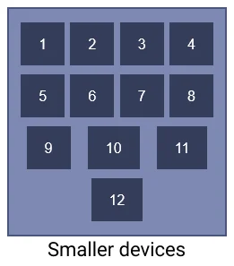
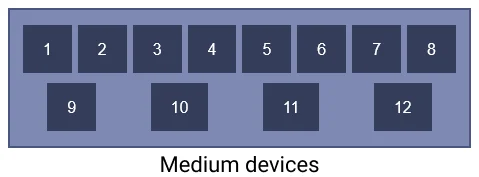
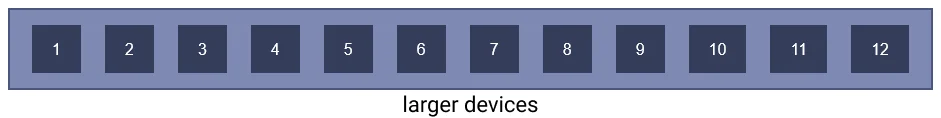
Flexbox or CSS flexbox allows the HTML elements to get automatically arranged depending on screen sizes.
It is a module that comes with lots of CSS properties and can be used to create complex layouts.
The main idea behind CSS flexbox is to give the container ability to change its item's size automatically to best fit in available space.
Here are 3 images that show how HTML containers arranged using flexbox automatically fits themselves according to device width.
CSS flexbox makes web developers life easy to design and arrange HTML elements in the webpage.
Before CSS flexbox it was quite difficult to fit and align-items on a webpage. The items were mostly laid out using float and position properties. Even though using just float and position properties we were unable to perform many tasks like:
- Aligning items vertically
- Making child element take up equal space even with unequal length of items
Understanding CSS flexbox
CSS flexbox is not a property its a module ( a W3C recommendation as of Oct 2017 ). It involves a whole set of CSS properties, some of its property is for the container itself on which flexbox is applied and some are for its child elements.
To understand flexbox you have to think in terms of 2 axes -
- the main axis: The horizontal axis
- the cross axis: The verticle axis
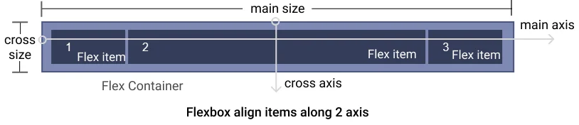
The items of the container will either lie along the main axis or the cross axis and these items can be placed at a various place along this 2 axis.
So now we have an idea, that container will align its item in 2 direction horizontal and verticle and along with these 2 directions, it will be spread in various ways, like align in the start, in the end, in middle, or spread in other ways.
How to use flexbox?
To start with flexbox we first need to define flexbox in our parent element so that other properties of flexbox could be used by the parent as well as a child element.
To make the container a flexible box define display: flex or display: inline-flex to the container:
- display: flex makes the container itself behave like a block element
- display: inline-flex makes container behave like inline element
You can see in the output above adding display: flex property creates a flex container and by default, its item is aligned in the horizontal direction.
All CSS Flexbox Properties
Since you know now how to create a flexbox in CSS, its time to know all the CSS properties associated with flexbox.
The flexbox properties can be divided into 2 parts:
CSS that is applied on the container itself (Parent) - Flexbox properties which is applied on the container itself are as follows:
CSS that is applied on items of the container (Child) - Flexbox properties which is applied on the items of the container are as follows:
Now let's see each property and what effect it creates with example.
Flexbox CSS that is applied to container itself (Parent)
Let's look at all the flexbox property applied to the flexbox container.
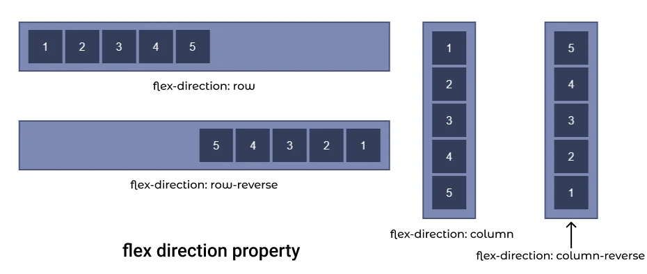
1. CSS flex-direction
Flexbox module provides a property called flex-direction which specify
what direction the children are laid out in.
flex-direction has 4 different values:
- row: It aligns flexbox items from left to right. It is the default value of flex-direction.
- row-reverse: It aligns flexbox items from the right end of the container to the left end.
- column: It aligns flexbox items from top to bottom in the flexbox container.
- column-reverse: It aligns flexbox items from bottom to top in the flexbox or container.
.container {
  display: flex;
  flex-direction: row; /* or row-reverse | columns | column-reverse */
}
Let's see flex-direction property with each value with examples.
I. flex direction row
If you want your container elements to be in a row then use flex-direction: row property. It is also the default value of the flex-direction property, so you do not have to explicitly add it.
Possible mistake: Just applying flex-direction property on any container won't work you have use it on the container with flexbox (display: flex)
.container {
  display: flex;
  flex-direction: row;  /* Default value */
}Output:
II. flex direction row reverse
To set container item in a row but in reverse direction use flex-direction: row-reverse property.
This property cause container items to start from the end of the container in reverse order.
.container {
  display: flex;
  flex-direction: row-reverse;
}Output:
III. flex-direction column
The flex-direction: column aligns the flexbox items in columns i.e from top to bottom.
.container {
  display: flex;
  flex-direction: column;
}Output:
IV. flex-direction column reverse
The flex-direction: column-reverse aligns the flexbox items in columns in reverse order i.e from bottom to top.
.container {
  display: flex;
  flex-direction: column-reverse;
}Output:
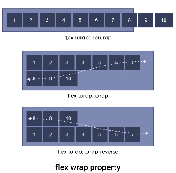
2. CSS flex-wrap
flex-wrap property is used to define whether the flex items are aligned in a single row or the items can flow to multiple rows.
flex-wrap property set values of wrapping items. There are three values that could be set for flex-wrap property nowrap, wrap and wrap-reverse.
- nowrap: It forces flex items to be in the same row. It is the default value for flex-wrap.
- wrap: It let flex items to flow to the next row if there is no space to fit in the same row.
- wrap-reverse: It specifies that flex items can flow to multiple rows but items will start from the bottom of the flexbox and after fill that it will flow to the upper row.
Let's see examples of each property value.
I. flex-wrap nowrap ( default )
The flex-wrap: nowrap property forces container items to stay in the same row. It items do not fit in the container then it is simply overflown.
.container {
  display: flex;
  flex-wrap: nowrap;  /* default value */
}Output:
II. flex-wrap wrap
The flex-wrap: wrap property let the items to flow to next row if it does not fit in the container.
.container {
  display: flex;
  flex-wrap: wrap;
}Output:
III. flex-wrap wrap-reverse
The flex-wrap: wrap-reverse property let the items to flow to the next row but in reverse order, i.e item will start from the bottom of the container and will flow in an upward direction.
.container {
  display: flex;
  flex-wrap: wrap-reverse;
}Output:
3. flex-flow CSS
The flex-flow property is shorthand for flex-direction and flex-wrap.
Combining both flex-direction and flex-wrap property the flex-flow property defines the cross-axis flow of the container.
The default value of flex-flow is row nowrap.
.flow1 {
  display: flex;
  flex-flow: column wrap-reverse;
  height: 400px; /* limiting height to see effect */
}

.flow2 {
  display: flex;
  flex-flow: row wrap;
}4. justify-content CSS
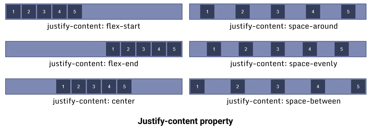
The justify-content property aligns flex items along the X-axis (horizontally) also known as the main axis in the flexbox. All flex line's items align horizontally according to justify-content value.
The justify-content property has 6 different values flex-start, flex-end, center, space-around, space-evenly and space-between.
- flex-start: Aligns items horizontally to the start of the container (default value).
- flex-end: Aligns items horizontally to the end of the container.
- center: Aligns items horizontally to the center of the container.
- space-around: Aligns items horizontally equally distributed.
- space-evenly: Items are so aligned that the space between container and item is the same as the space between items.
- space-between: Aligns items horizontally between the start and end of the container. The first row starts from the left and the last row touches the right.
Let's see examples of each value.
I. justify-content flex-start
This flex-start is the default value of the justify-content property, it aligns container items horizontally to the start of the container.
.container {
  display: flex;
  justify-content: flex-start;
}Output:
II. justify-content flex-end
This flex-end value of the justify-content property aligns container items horizontally to the end of the container.
.container {
  display: flex;
  justify-content: flex-end;
}Output:
III. justify-content center
This center value of justify-content property aligns container items horizontally to the center of the container.
.container {
  display: flex;
  justify-content: center;
}Output:
IV. justify-content space-around
This space-around value of justify-content property aligns container items horizontally to the end of the container.
.container {
  display: flex;
  justify-content: space-around;
}Output:
Aligns items horizontally and equally distributed.
V. justify-content space-evenly
This space-evenly value of justify-content aligns container items horizontally evenly in the container, the space between the items is equal to the space between items and the container.
.container {
  display: flex;
  justify-content: space-evenly;
}Output:
VI. justify-content space-between
This space-between value of justify-content property aligns container items horizontally between the start and endpoint of the container, both end item touches the container ends.
.container {
  display: flex;
  justify-content: space-between;
}Output:
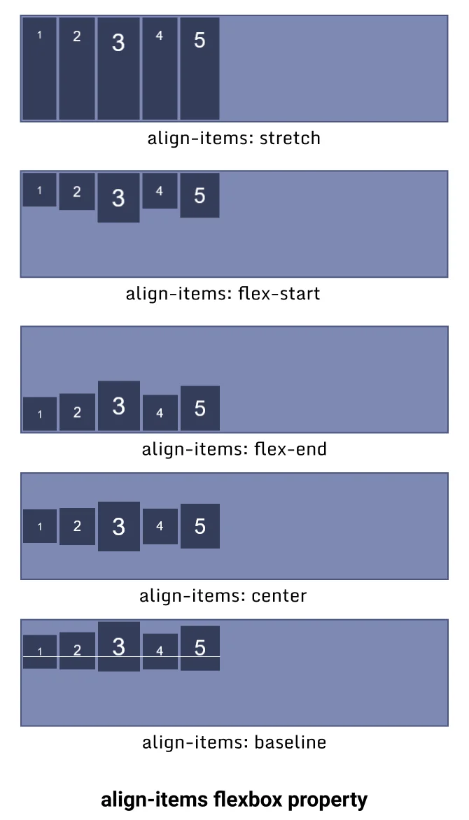
5. align-items CSS
The align-items property aligns the container items along Y-axis (Vertically), also known as a cross-axis in flexbox.
Note: The align-items is a single-line property if your container item wraps to the new line then it won't work for the new line. To align items as a whole use the align-content property.
The align-items property has 5 different values flex-start, flex-end, center, baseline and stretch.
- stretch - It stretches the flex items along the container to fill the container but min-width and max-width are applied to items if mentioned. It is the default value of the
align-itemproperty. - flex-start - It aligns flex items to the top of the container.
- flex-end - It aligns flex items to the bottom of the container.
- center - It aligns flex items in the center of the container.
- baseline - It aligns flex items in such a way that their baseline aligns.
Let's see an example of each value of this property.
I. align-items stretch
The flex-end value align-items property stretches the items along Y-axis and covers 100% height unless the min or max value is defined.
.container {
  display: flex;
  align-items: stretch;  /* Default value */
}Output:
II. align-items flex-start
The flex-start value align-items property aligns the items to the top of the container.
.container {
  display: flex;
  align-items: flex-start;
}Output:
III. align-items flex-end
The flex-end value align-items property aligns the items to the bottom of the container. The items start from the bottom of the container.
.container {
  display: flex;
  align-items: flex-end;
}Output:
IV. align-items center
The center value align-items property aligns the items to the center of the container along the Y-axis.
.container {
  display: flex;
  align-items: center;
}Output:
V. align-items baseline
The baseline value align-items property aligns the items along their baseline.
.container {
  display: flex;
  align-items: baseline;
}Output:
1
2
3
4
5
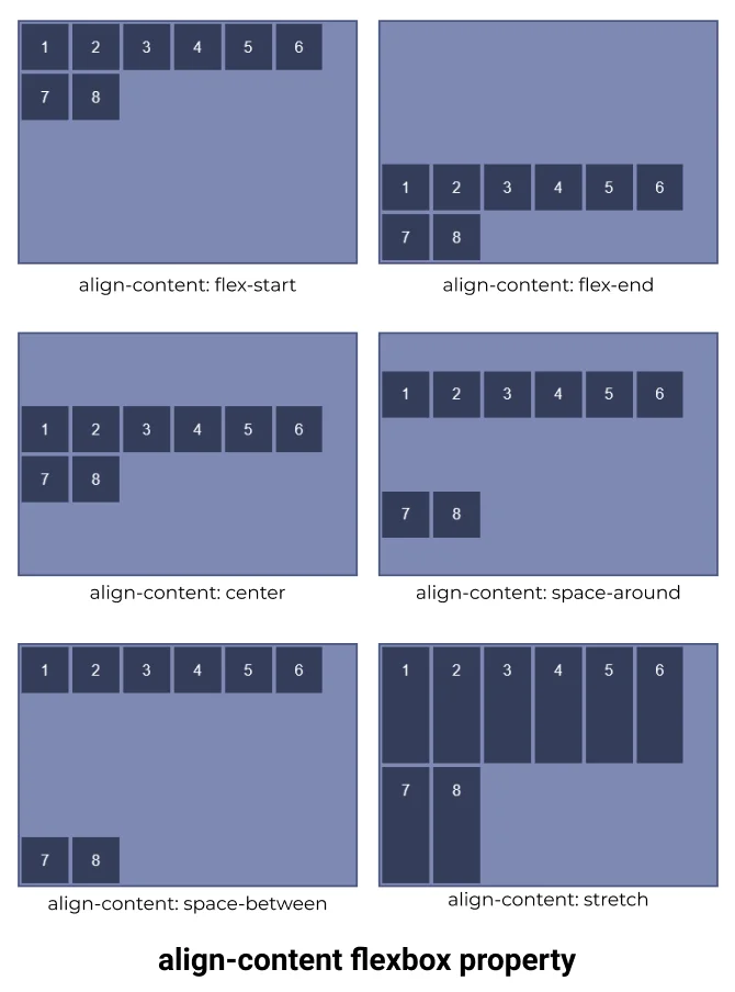
6. align content CSS
The align-content property works the same as the align-content property along Y-axis but the only difference in both is that instead of aligning flex items align-content aligns the flex container's line as a whole
The align-content is multiline property. Its effect is not visible when there is only one row in the flexbox.
The align-content property has 6 different values flex-start, flex-end, center, space-around, space-between and stretch.
- flex-start: Aligns items to the start of the container packed together.
- flex-end: Aligns items to the end of the container packed together.
- center: Aligns items to the center of the container packed together.
- space-around: Aligns items equally distributed along each row packed together.
- space-between: Aligns items packed together between the start and end of the container. The first row starts from the top and the last row touches the bottom.
- stretch: Aligns items packed together and stretched along the cross axis of the container.
Let's see an example for each value of the align-item property.
I. align-content flex-start
flex rows aligned to flex-start which forces flex-items to start from the top together in a group.
.container {
  display: flex;
  align-content: flex-start;
  flex-wrap: wrap;
}Output:
II. align-content flex-end
flex rows aligned to flex-end which forces flex-items to start from the bottom together in a group.
.container {
  display: flex;
  align-content: flex-end;
  flex-wrap: wrap;
}Output:
III. align-content center
flex rows align to the center of the container together in a group.
.container {
  display: flex;
  align-content: center;
  flex-wrap: wrap;
}Output:
IV. align-content space-around
The space-around sets flex lines to align evenly in the container.
.container {
  display: flex;
  align-content: space-around;
  flex-wrap: wrap;
}Output:
V. align-content space-between
flex rows aligned in space between the container's first row touching the top and the last row touching the bottom.
.container {
  display: flex;
  align-content: space-between;
  flex-wrap: wrap;
}Output:
VI. align-content stretch
flex rows items are stretched along the cross axis.
.container {
  display: flex;
  align-content: stretch;
  flex-wrap: wrap;
}Output:
Flexbox CSS that is applied on container's items (Child)
There are 6 different flexbox properties that are applied to the specific item of the flexbox container.
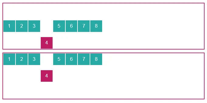
1. Flexbox order
The order CSS property of flexbox defines the order of an item in flexbox. Items of the container are sorted according to their order value in ascending order and then by their source code order.
The default value of the order is 0.
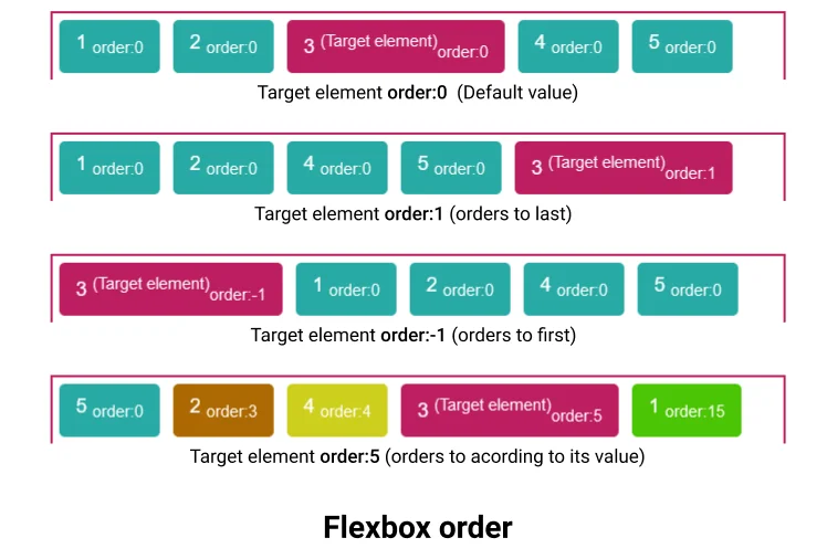
Order accepts only Integers (both positive and negative), decimal values are not allowed
flexbox order example
#target1 {
  order: 0;
}

#target2 {
  order: 1;
}

#target3 {
  order: -1;
}

#target4 {
  order: 5;
}2. flex-grow CSS
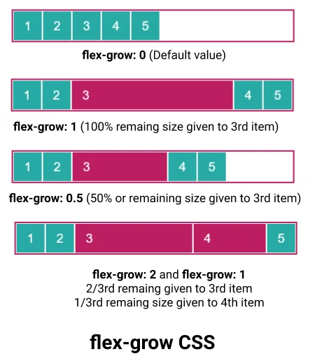
The flex-grow CSS property defines a flex grow factor of any specific item's main size, where the main size is either height or width of the container depending on the flex-direction property.
The flex-grow property defines how the remaining space in the container will be assigned to the item, where the remaining space is the size of the container which remains after all items fit in.
The flex-grow value is always positive or 0, the negative value is not supported.
flex grow example
Suppose you have 5 items of equal width 50px in a flex container with a width of 400px, and for simplicity suppose there is no margin between the items.
Remaining size: (400 - 50*5) = 150px
Now, if we set flex-grow: 1 to 3rd item then this 150px will be given to it. And its total width will become 50px + 150px = 200px.
If we set flex-grow: 0.5 to 3rd item then this 75px will be given to it (50%).
If we set flex-grow: 2 to 3rd item and flex-grow: 1 to 4rt item then 2/3 of remaining (100px) will be given to 3rd element and 1/3 of remaining size will be given to 4th element(50px).
#target1 {
  flex-grow: 2;
}

#target2 {
  flex-grow: 1;
}

#target3 {
  flex-grow: 0.5;
}3. flex-basis
The flex-basis CSS property is used to set the size of the flex item.
In case both flex-basis and width (or height) are defined for an element then flex-basis has priority.
#target1 {
  flex-basis: 150px;
}4. flex-shrink
The flex-shrink CSS property is used to set the flex-shrink factor for a flex item.
It determines how much a flex item will shrink relative to the rest of the items in the container when the container is full.
#target1 {
  flex-shrink: 5;
}5. flex
This is a shorthand property for flex-grow, flex-basis and flex-shrink.
/* 1 value, unitless number: flex-grow */
flex: 1;

/* 1 value, width/height: flex-basis */
flex: 15px;
flex: 10%;

/* 2 values: flex-grow | flex-basis */
flex: 1 30px;

/* 2 values: flex-grow | flex-shrink */
flex: 2 2;

/* 3 values: flex-grow | flex-shrink | flex-basis */
flex: 2 2 10%;
6. align-self
The align-self property overwrites the align-items value for individual items. It aligns the item within the container on the Y-axis.
The align-self property has no effect on block-level items.
.container1 {
  display: flex;
  align-items: center;
}

#target1 {
  align-self: self-end;
}

.container2 {
  display: flex;
  align-items: flex-start;
}

#target2 {
  align-self: center;
}Points to remember:
- CSS flexbox is a layout model which is used to position items in a container in 2D.
- To start with flexbox you have to define your parent container as a flexbox by using
display: flex | inline-flex. - Flexbox provides 6 different CSS properties for the parent element and 6 different CSS properties flexbox items.
- To practice CSS flexbox in a fun way you can visit flexbox froggy, which provides a game that uses flexbox knowledge to play, you can practice flexbox here by playing the game.